Design Evaluation
There are many factors that determine whether or not a good design works in today's world. Journalism is something I am involved with quite a lot as News Editor for the Dixie Sun News. Something we spend a lot of time with is how to make our newspaper visually appealing from a design standpoint so it attracts more readers. Bad design for a newspaper can be obvious and can detract from the content of the newspaper. We recently updated the design for the front page of the Dixie Sun News to be more appealing. Although it wasn't me who designed the front page, I may be biased towards the Dixie Sun News because of my position on staff. But in this post, I will compare the Dixie Sun News' front page to the Southern Utah University's student newspaper front page and what makes its design superior to SUU's.

There is a lot of noise and unnecessary clutter on the front page of SUU's University Journal. Starting from the top, there clip art and a banner saying "Welcome back, students," which in my opinion is annoying and belittles the audience. Extra space at the top is filled with a speech bubble and the cut out of a head, which also adds unnecessary clutter. It seems like someone just stuck the blue speech bubble on top of the page, and it doesn't seem like it fits. There is not a lot of continuity between the font, pictures, and other elements of the front page. There is also not a central picture that your eye is drawn to. All the pictures are roughly the same size, so it's confusing to the reader as to what picture is the most important one. All the stories are in a vertical split. And finally, at the bottom of the page, extra space is also filled in with clip art and random text that is confusing and cluttered to the reader.
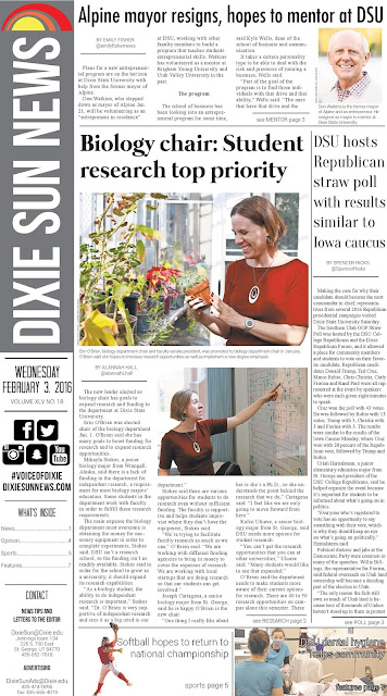
This is the Dixie Sun News' front page. For me, because I've worked with the Sun for so long, there is an element of Gestalt associated with the front page. Everything about the Dixie Sun News' front page is continuous and seems like it fits together. There is a larger picture and smaller pictures, which gives your eye a direction and point to the front page. The color scheme is simple and there's a recognizable logo. Even the logos of the social media seems like it all fits together. There is a lot of lines in this front page as well, which adds a lot to the overall layout. It's the "golden rectangle" ratio of the rectangles and squares on the front page.

