Tuesday, April 26, 2016

Communication artifact: Swig website


I created the website revamp for Swig, a local beverage company. Our website redesign can be found here: http://sprex2.wix.com/swig. I used many of the axioms of web design to create the website. The previous website, https://www.swignsweets.com/, needed a lot of help to make it more visually appealling to our audience. Here is a screenshot of the original website:


The original website had bright colors that do not translate well to a website. Elements of the website look pasted on sloppily; even the logo is cut off. The colors and design on the original website look like they were designed by an elementary school student. In my website redesign, I wanted to maintain the colorfulness of the original, without the "cheeseness" while keeping it intuitive for first time users. Our logo was designed to look like a drink from Swig getting mixed. The background of the first panel on the website incorporates movement and subtle swirling colors to have an effect of mixing. Most of my inspiration for the website was from our revamped mantra: "Mix it up." 

One of the first axioms of web design is a strong grid system. I incorporated a vertical grid system that works well with scrolling on both computers and cell phones.


The original website did not make me think of Swig drinks or trying one of their cookies. On their home page, there was no images of their drinks. The image of the cookies on their front page looked like cardboard rather than the delicious cookies they are in real life. In my website, I incorporated images of Swig drinks in the sun and also a more appealing picture of their cookies that Swig had buried on their original website. 


I also incorporated subtle movement on my page so it looks like a drink with bubbles from Swig. My objective was for the homepage to drive potential customers to Swig. So I made the entire homepage look "appealing" and ready to drink. Using other axioms of web design, I alternated sides that the pictures and text was on to drive eye movement down the page in angles. The design is aesthetically pleasing and is easy to use. I used contrast in colors and fonts to drive eye movement. The entire reason the website needed a revamp was to make it look more modern for our objective customers. 

All of the colors are consistent across the revamped design of the cup and new logo as well. 


Tuesday, April 5, 2016

Mis-en-scene: Director of Photography for "Now You See Me" (2013)


Now You See Me (4/11) Movie CLIP - Robbing the Bank (2013) HD: https://www.youtube.com/watch?v=Vx9EOI4RyBs

In this scene of the film "Now You See Me," there is a bunch of different ways the Director of Photography uses different camera angles and lighting to create the best possible scene of the bank robbery. In this scene, the Four Horsemen magicians "rob a bank" for a magic show. The scene is set up to look like a real magic trick. 


Right off the bat, Fong uses a number of lens flares and manipulates lighting to show authenticity in the camera design, as shown below. The lighting in this scene makes it feel like you are actually watching a show in Las Vegas.  


An establishing shot of Paris without the Eiffel tower shows his creativity in setting the scene.


More lens flares:

Later in the scene, Fong uses creative camera movements to follow the subject of the scene, making it feel like the audience member is actually following her.


The focal point of the scene (money flying around) is achieved with a little bit of CGI, but the camera remains focused on the man and his emotions, rather than the money flying around. This makes the CGI additive seem subtle and unnoticeable because all the focus is on the character. 


During the entire scene, camera movement never stops. It alternates between wide shots and close shots of the performers on the stage. He captures this motion with a high speed cameras that couls move 35 mph-- most commonly used in football games.

The Director of Photography had to create the scene to look like a cross between a heist scene and a magic trick. 
First of all, according to the job description, the Director of Photography "is the chief over the camera crews working on a film, television production or other live action piece and is responsible for achieving artistic and technical decisions related to the image."
The Director of Photography for "Now You See Me" is Larry Fong, whose other film credits include "Batman v Superman: Dawn of Justice," "300," and "Watchmen." These films boast big budgets and elaborate sets with lots of action. Fong used his experience working with big films like this to make the action in this scene from "Now You See Me" pop.


Wednesday, March 23, 2016

Composing my frame


I took this photo shortly before sunset, when the sun was shining straight through the west windows of the Holland Building's front lobby. There are several measures I took to compose this frame, including mixing human and architectural elements. I followed the rule of thirds when taking this shot, placing the students' heads on the lower vertical third. I took the photo when there was more room in front of them to symbolize movement. The other "rule of third" lines are literally represented by the edges of the walls, the stone column, and the line on the ceiling.

There are also lines along the z-axis on the floor and walls leading into the middle of the photo, which is the light source. The sharp sunlight in the background provides a backdrop for the photo and makes the students, which is the focal point, stand out more.

Thursday, March 17, 2016

Axioms of Web design


The VICE News website is a very well-designed website that makes navigation easy for visitors. It is one of the best designed news websites that I have seen. To start it off, the header at the top of the page is very clean with just a simple logo, the different topics to click on, a search option and places to find VICE News on social media. The header is simple and doesn't distract from the rest of the website.

One of the axioms of web design is a strong grid system. VICE News' website homepage is nothing but a grid, with a larger featured story at the top and more stories below. Every story features a picture, a headline, and a short summary. All of these elements working in a grid makes it very user friendly and easy to find what you're interested in.


As you continue to scroll down on the homepage, there are even more stories featured with larger pictures. It is very clean and feels almost like social media as you scroll down looking at all the stories. It's very easy to use for a first-time user and engaging as you scroll down the homepage looking at all the stories, which is another axiom of great web design. There are more pictures than text on the VICE News homepage. And as you continue scrolling, you realize there is no bottom to the homepage. You can keep scrolling through stories for hours.


The website also translates very well for mobile devices, which is an important axiom of good web design. It doesn't just Here is an example of a screenshot from vicenews.com on an iPhone: 


One of the reasons I like VICE News is because it often covers stories that aren't on other news sites and finds different angles to look at news stories that you can't find anywhere else. VICE News' website is unique when it comes to typical news websites. VICE News' unique way at looking at the news and the world is reflected with their engaging website. 


Tuesday, February 9, 2016

Design Evaluation


Design Evaluation


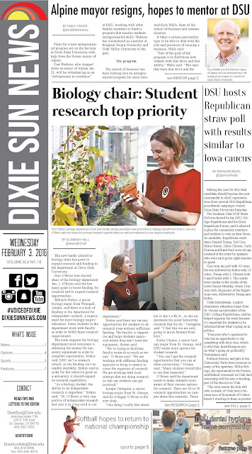
There are many factors that determine whether or not a good design works in today's world. Journalism is something I am involved with quite a lot as News Editor for the Dixie Sun News. Something we spend a lot of time with is how to make our newspaper visually appealing from a design standpoint so it attracts more readers. Bad design for a newspaper can be obvious and can detract from the content of the newspaper. We recently updated the design for the front page of the Dixie Sun News to be more appealing. Although it wasn't me who designed the front page, I may be biased towards the Dixie Sun News because of my position on staff. But in this post, I will compare the Dixie Sun News' front page to the Southern Utah University's student newspaper front page and what makes its design superior to SUU's. 


There is a lot of noise and unnecessary clutter on the front page of SUU's University Journal. Starting from the top, there clip art and a banner saying "Welcome back, students," which in my opinion is annoying and belittles the audience. Extra space at the top is filled with a speech bubble and the cut out of a head, which also adds unnecessary clutter. It seems like someone just stuck the blue speech bubble on top of the page, and it doesn't seem like it fits. There is not a lot of continuity between the font, pictures, and other elements of the front page. There is also not a central picture that your eye is drawn to. All the pictures are roughly the same size, so it's confusing to the reader as to what picture is the most important one. All the stories are in a vertical split. And finally, at the bottom of the page, extra space is also filled in with clip art and random text that is confusing and cluttered to the reader.    


This is the Dixie Sun News' front page. For me, because I've worked with the Sun for so long, there is an element of Gestalt associated with the front page. Everything about the Dixie Sun News' front page is continuous and seems like it fits together. There is a larger picture and smaller pictures, which gives your eye a direction and point to the front page. The color scheme is simple and there's a recognizable logo. Even the logos of the social media seems like it all fits together. There is a lot of lines in this front page as well, which adds a lot to the overall layout. It's the "golden rectangle" ratio of the rectangles and squares on the front page.  

Wednesday, January 27, 2016

Contrast, Balance, Harmony


This is a picture my brother took last winter on an old train bridge near Snoqualmie Pass in Washington state. It was taken on a sunny day after some light snowfall while my family was all hiking in the mountains to look for a Christmas tree. The bridge seems to disappear into the line of black and white trees, which is part of the reason this picture looks awesome to me. Besides the story behind the photo, the contrast, balance, and harmony of the image makes it especially beautiful to me. 

There is stark contrast within this image. Without the corner of sky in the corner, one may think the photo is in black and white. The pure white of the snow is contrasted with the black of the shadows under each of the tree branches and the bridge. The uniformity of color and tone of the trees and bridge is contrasted with the bright rays of light coming from the sky in the upper right corner of the picture. The smooth snow on the bridge is also contrasted by the sharper looking texture of the trees. The striking black and white trees brings almost a cold, ominous feeling to the image, which is contrasted by the warm, blurred sunlight. 

There is also a lot of balance within this photo. The largest part of the bridge is following the rule of thirds, so the continuity leads your eye into the center of the image as it grows smaller. Finally, there is a lot of harmony within this image. Everything in the photo fits together. It seems like the trees and the bridge were placed in the image to match. The bridge literally becomes a part of the trees as it disappears into the forest and it almost seems like the trussels are growing out of the trees. It makes the bridge look like it could be growing out of the forest, creating harmony between the industrialization of bridges built for trains and the nature around it. Everything fits together in this photo and is completely harmonic. 

This image of this high train bridge in the forest follows all the principles of Gestalt to make it seem like it is all one form. It is what makes this image so fun for me to look at. 


Tuesday, January 19, 2016

Visceral Response


This is a photo that invokes a powerful Visceral Response for me that is absolutely stupefying. It was taken during on my last weekend home during the latest winter break. I was on an early morning run next to the Snoqualmie River near Mt. Si in Snoqualmie, Washington, just before sunrise when I snapped the picture. Exploring the forest and the rivers around by home is Washington state is something I grew up doing, which is why each time I see an image of the Washington wilderness like this one. I have many memories splashing through the river and climbing the mountain, so when I look at this photo, I feel anxious like I need to start running and exploring what is beyond the line of trees in the photo. I also have the urge to take of my shoes and start wading through the cold, refreshing water.

There are many reasons from a design standpoint that this image can create a Visceral Response. There are so many different lines in the image going in all different locations. The strongest lines are the hard, horizontal line of the riverbank and the straight, diagonal line of the mountain side. There are also a bunch of lines in the lower third of the image among the fallen trees. Some of the focal points of the image are the strong horizontal lines of the trees, especially the one front and center. 

The colors of this image also draw me into the image. There are the different shades of muted greens and browns in the trees, mountainside, and river. But it's the sharp blue and amber colors of the sky that is the focus of color in the photo. The golds in the emerging sunrise behind the trees contrasts with the blue in the top of the sky. The subtle gold draws my eyes to the corner of the photo and makes me want to find out what is beyond the mountain in the distance.

Although the images in the photo are not up close, there is a palpable texture throughout the picture. There is the almost soft, carpet-like texture of the trees on the mountain. There is the slightly smooth and rippling texture of the river. And there is the shiny rough texture of the trees in the river. The overall texture of this photo is contrasting soft and stark, which draws me in.

This picture of the moment standing by the river almost makes me breath in the cool mountain air and hear the bubbling of the water. This Visceral Response really makes me want to dive into the photo and be part of that moment again.  


Hello all!

My name is Spencer Ricks and I am creating this blog for my Communication classes at Dixie State University. I am a sophomore from Snoqualmie, Washington— a small town 30 miles from Seattle. I am News Editor for the Dixie Sun News, and I hope to take what I learn about design to apply it to my job there. I'm not a fan of talking about myself, so that;s a wrap!

Stay tuned for more content to come soon!